



LINER NOTES is an interview series with the people behind the brand identities, narratives, campaigns, films, and editorial projects that define how startups and tech companies show up in the world.
Adam Ho is a graphic designer and image maker based in Brooklyn, NY. He is the Head of Design at Fal, a generative media platform for developers currently valued at $4B+. Previously, Adam worked on the brand design teams at Cash App, Zendesk, and more.
He also runs Adam Ho, I.S.P., his independent studio practice where he creates large-scale visual brand identities and interaction design for emerging technology companies. Companies Adam has worked with include Jasper, Archetype, Paradigm, Matrix, Square, Coinbase, Vanta, Webflow, and more.
The following interview has been edited and condensed for length and clarity.
Katie Chiou: Can you give us an overview of your practice and the types of companies and design problems you usually work with?
Adam Ho: I call myself a graphic designer and an image maker. I make silhouettes for brands and companies, usually ones working with emerging technologies like AI and crypto. I’ve also worked with many venture capital firms where it’s been fun to think about how to reinvent classic corporate finance aesthetics.
KC: Have you always been a brand designer? What do you think differentiates the skills of a strong product designer vs. a strong brand designer?
AH: Most of my design career has been brand design, but I actually studied a lot of product design outside of school. Around 2016-2017 is when I think the tech industry started differentiating between the two. Up until that point, the studios I looked up to and admired did both so I wanted to be able to do the same. When I first joined Zendesk, they wanted to nurture both disciplines so we worked closely with the product design team.
Earlier in my career, a lot of product design thinking went into how I approached brand work, it was very systematic. But at some point I started to feel like that was too rigid, and I started to value zaniness and whimsy a lot more. I also started taking graphic design as a discipline way more seriously.
To me, brand design is the corporate function of graphic design. Graphic design is still definitely more corporate than art, I would say, but it’s a more purist, artistic version of design. Brand design and product design are usually considered synonymous, but one of my friends said once that he can trust hiring a brand designer to be a product designer, but not the other way around.
Being a good graphic designer or brand designer teaches you to discern typography at its core, and that can translate into product very well. But typographical details get lost in a lot of modern graphic design, so that edge in discernment can be really interesting. Vice versa, product design has gotten a lot more complicated since the last time I studied it intensely. There were components, and now there are variants of components, etc. There are all these systematic things that are hard for my brain to process, but I think those ways of thinking are a good way to translate a brand.
KC: What do you think corporate design and editorial/art direction can learn from each other?
AH: There’s a lot! The most interesting graphic designers or web designers I know come out of The New York Times or Bloomberg Business Week and although I think it’s a dying art to make beautiful editorial pieces, you’re beginning to see a lot of that type of work in tech as well. There’s all these beautiful microsites, reports, even books, etc.
In my role at Fal, I’m trying to infuse a level of excellence and editorial creativity into our work.
If we were your dream creative studio, what would we make? It turns out that a lot of the stuff that we naturally want to make is also stuff that people are asking for. Our marketing team constantly asks if we can design a book or a microsite, etc. Now we have a lot of tools at our disposal to make these more frequent standalone projects look extremely interesting and intentional.
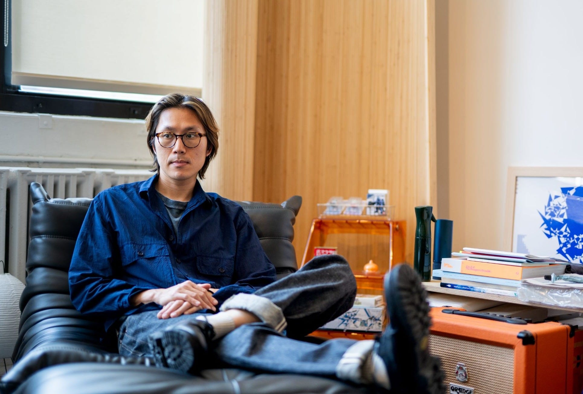
Yang You, Head of Design at Parallel describes Adam Ho as a “fashion designer”: “What I admire most about Adam’s process is that I would compare him to some of the most renowned fashion houses I look up to. He’s a genuine creative partner, like approaching a fashion designer for your house because you want their specific style and point of view. You are asking them to build something for you through that lens, rather than going to them with a fully formed brand and asking them merely to execute it.
People go to Adam because they want him to create something new.”
KC: When you start working with a company, what are some of the cues and company truths you look for to form the visual brand identity?
AH: A lot of it is intuition based. I do a brief intake session where I ask the founders questions like “What are your short-term and long-term plans? Who are your dream customers?”
You can get a sense from how the founders talk about themselves and the company, and you can read between the lines. Sometimes founders will drop references or I’ll ask them to identify past projects of mine that they gravitate towards, and I’ll try to find the through line.
With early-stage founders, it’s like trying to look into the future: “How would you, as the founder, or you as early employees of the company, want to be perceived?”
Even if it’s just from something little like the 80-pixel icon on LinkedIn.
KC: Once you have those cues, how literally do you want the visual system to relate back to the company or product?
AH: Sometimes things just line up.
From Yang: “Adam’s work is uniquely distinctive and quite difficult to replicate. A lot of designers pull from references or styles that are timely in the moment, but Adam is continually developing his own language. For example, He likes to begin with very basic primitives, which I appreciate. He often seems to be referencing himself and operating within a league of his own.”
For Fal, I used three typefaces that became congruent to what the company actually does. I used a typeface called Focal that’s a little bit rounded. It basically looks like Helvetica being printed, so it has this rounded feature. It’s called Focal because of the camera aperture, so I was like, okay, that’s imaging. Then I use another font that is more pointillism and dot-based, and I was like, okay, that’s the processor. And then I use the monospace font, which is like the typewriter, so it’s typewriting, prompt, processor, the machine, the data layer. And then Focal is the main typeface that’s imaging.
So I try to look for things that typographically and graphically make sense. And it doesn’t have to make sense to the consumer, but you can feel that if people go deeper, there’s something there. I think that’s what I always try to do with my work. Even if only two people discover it.
There’s a quote that Brian Eno has that’s something to the effect of—“Whatever you now find weird, ugly, uncomfortable, and nasty about a new medium will surely become its signature.”
I always want people to leave their own individual signature.
KC: What does that signature look like when so much of the work can now be generated?
AH: At Fal, we do a lot of generative and AI imagery, and maybe this sounds cliché, but I always try to add some human process in it.
We did an abstract graphic recently, and I was comparing it to what I would do in Photoshop. I always found myself leaning toward the Photoshop ones. But testing out the models, it’s really good at variants, so I’ll have it spit out 100 images—shot selection is a thing now. I’ll put a layer of that image onto my handmade image, and then I’ll brush over it again.
This forced tension almost creates a fingerprint in there. It’s like when artists leave a little Easter egg, but no one’s going to know until they die, and then they’re like, “Oh, look for that thing.”
I think people can feel those moments even if they don’t know exactly what it is. If you watch a Christopher Nolan movie, you might later learn how he shot something a certain way because he had to use the IMAX camera or an event that happened on set like a dolphin flying out of the water and they had to capture it. The context is invisible, but stuff like that makes for an interesting story, and then strategically, it’ll just be more interesting to the consumer.
From Yang: “Another thing that is unique about Adam—and perhaps true of many highly talented brand designers—is that he is emotionally tied to the work. He is deeply proud of every brand he puts into the world, and he is continually curating and refining his best work.
I think that is part of why he has produced some of the most recognized and strongest work in the space.”
KC: How do you think about, if even at all, the balance between an identity that’s legible within its industry vs. is differentiated?
AH: It’s always going to be more compelling if it’s slightly, a little bit different. I think Virgil Abloh was right where you change something 3%, and that percentage can be 2% or 10%, but it always needs to include something that doesn’t feel natural at first. And then that creates something that could be a trending thing a few months down the line, because people will be like, “Oh wait, that combination makes so much sense.”
As an example, I did an experiment with an identity where I thought to myself, “What if I could take this platform to feel more editorial?” And then I referenced the typeface from a magazine and I was like, “What if the system was fully typographic with this interesting attitude?” That typeface shift is more of a tonal shift. It’s just ever so slightly a little bit different, but it’ll make sense. A small change will make a big difference once that whole thing is done. That’s why I always emphasize typography.
I also just think it’s more natural now in this generation and age to combine things. You see it a lot in music. A lot of my favorite music now is combining four or five different genres and seeing how they work together.
Sometimes an identity will need a very specific purist take, so I’ll have my references in my head where it’s like, I can only use one type of component from this time period, and then try to treat it. For Archetype, for example, it was very much that way. Obviously it’s modern typefaces but it’s done in such a way where, if they had motion design in the ’60s, it would look kind of like that.
KC: When you’re working on a company’s visual identity, do you ever look at industry peers?
AH: Of course I do some research, but I almost always rely on what I know, rather than looking at peers. I think that kind of thinking almost always makes me do worse work because I’m so fixated on, “Oh, I want to use this color, but then this brand has it,” and then you think of another color and you’re like, “This brand has it.” So you don’t really go with your gut. Obviously it depends on the project, and if someone really owns this color, let’s try not to use it, but it’ll bring you down a very narrow path.
KC: Has new technology changed what feels interesting to you? Is there anything you’re sick of seeing?
AH: The whole world is very cyclical now. There’s stuff obviously I’m sick of, but I would think that it was cool if I didn’t know that you could vibecode it in two seconds. The technology available changes how you perceive art and design. That’s a weird mental thing. You almost want to be tricked, right?
For example, there’s this whole movement of people who are TouchDesigner experts, and they’re so mad at vibecoding because there’s now a TouchDesigner MCP where you can just prompt and it’ll do all these things for you.
The surface-level stuff is always going to become outdated quickly. So, you have to try to approach things slightly differently. If you can vibecode an ASCII design, what’s the slightly different take? Can you focus on the actual font of the ASCII? People would probably just pick out a random monospace font, but a decision like that affects the whole silhouette. It affects every character moving. Can you go a little bit deeper?
I think as I get older and progress in my career, I start to appreciate the simpler things. A lot of the earlier years were about trying to look for something cool and novel.
For example, I have my favorite bands like Beach House, and I’ll listen to their references like My Bloody Valentine, and I’m like, “Oh, they sound so similar. How did I not know this?” That stuff interests me.
I try to approach that in my work now too. Obviously in the tech industry, the focus is very much needing something quick and flashy to look at. But we’re trying to infuse a little bit more thoughtful intention, and that’s something I’ve been trying to do.
It’s not rejecting modernity. It’s trying to see how we can approach it in this way even with new technologies. My new portfolio which I’m launching soon has all the new technology, but it still feels like a book. I try to look for those tactile qualities.
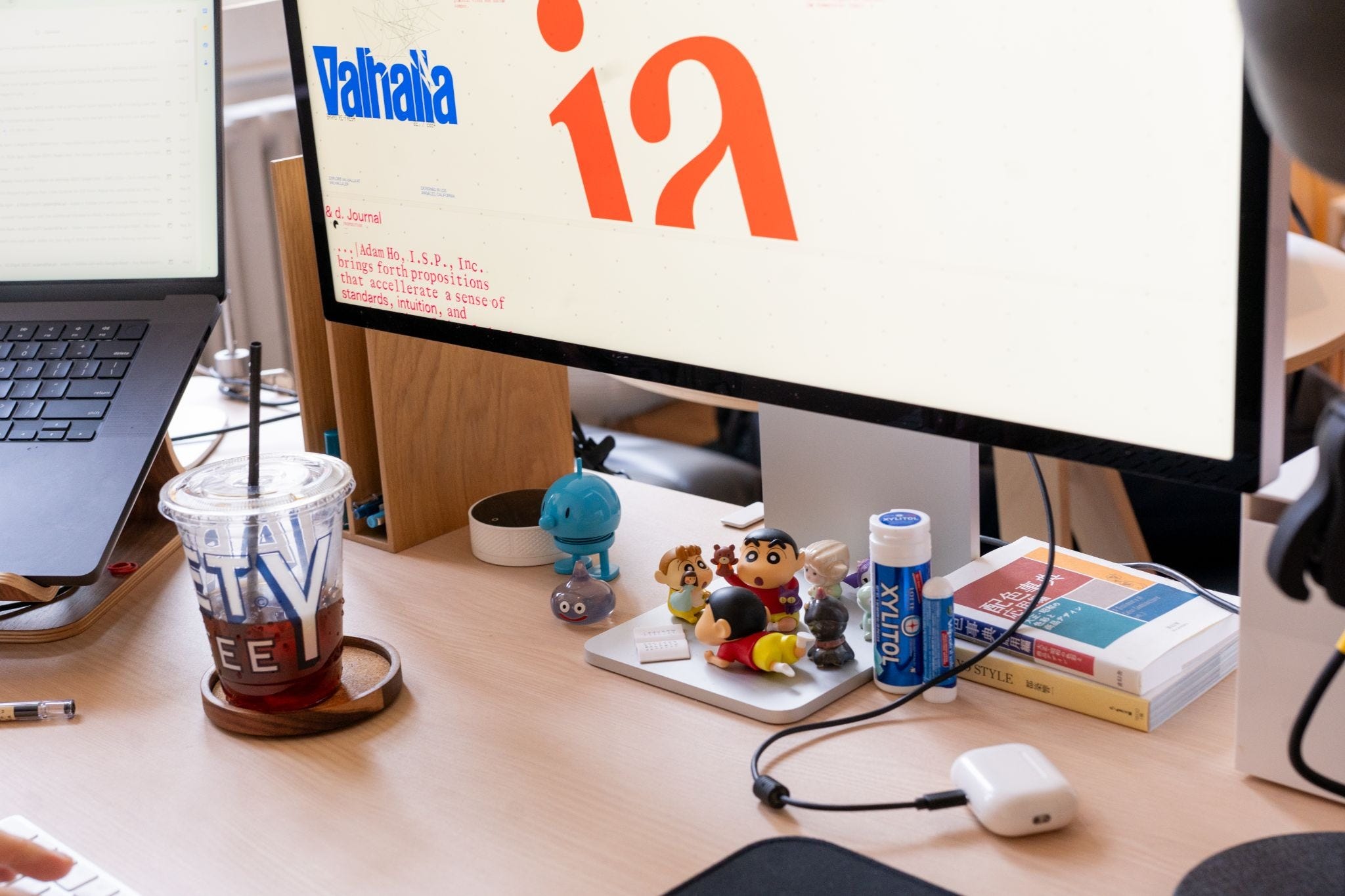
Photo Credits:
Adam Ho, I.S.P. studio photos: Gibson Chu
LINER NOTES is an interview series with the people behind the brand identities, narratives, campaigns, films, and editorial projects that define how startups and tech companies show up in the world.